Dental B2B e-commerce app
Client
Client is a B2B E-Commerce Dental Practices
Project
UX & UI
Objective
To create a user-friendly e-commerce platform that not only simplifies purchasing but also helps users monitor their inventory and manage restocking efficiently with a scanning feature.
Deliverables
-
Wireframes
-
High-Fidelity UI Designs
Key skills
-
UX Research & Strategy
-
UI
-
Cross-Functional Collaboration
-
Design consistency
Context
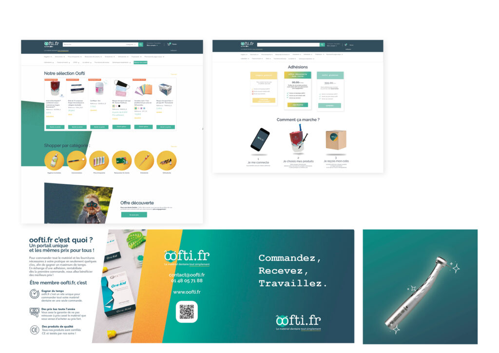
E-Commerce Website Design: I designed and developed the client’s e-commerce website prior to the app, establishing a consistent brand look and feel that supports user experience and drives conversions.
Comprehensive Brand Assets: Created all web and print materials in-house, including product catalogs, communication assets, and promotional materials to reinforce a unified brand identity across channels.
1. Discovery & Research
- Conduct interviews & contextual inquiries with dentists to identify pain points in their current supply and inventory management processes.
- Identify how users manage products, from tracking stock levels to reordering, and where scanning could fit into and enhance their processes.
- Competitive Analysis: Research similar B2B inventory and e-commerce solutions to identify best practices, gaps, and opportunities for differentiation.
- Define User Personas: Create detailed personas that represent typical users (e.g., office managers, dental assistants, dentists…) and outline their needs, motivations, and goals.
2. Define
Define Scanning Use Cases: Identify and outline specific scenarios where the scanning feature will add value. Examples include:
- Product Restocking: Allowing users to scan items directly from inventory shelves to add them to a reorder list.
- Inventory Audits: Enabling staff to scan products for quick, accurate inventory checks and updates.
- Quickly Adding Items to Reorder Lists: Allowing users to scan items as they go, automatically adding them to a “frequent reorder” list or marking them for monthly orders.
- Monthly Reorder Planning: Users can scan items needed on a regular basis to add them to monthly reorder lists, streamlining repetitive orders.
Feature Prioritization: ensure a smooth integration of scanning with other features like reorder planning and inventory monitoring.
User Journey & Task Flow Mapping: Map the overall user journey, weaving in the scanning, reordering, and inventory management flows to ensure a seamless user experience. Consider how users might:
- Start with a Quick Scan: Initiate a scan session from their dashboard to add to a reorder list.
- Review and Confirm Reorders in a List View: View scanned items, add details or quantities, and schedule them for monthly or one-time orders.
- Complete Inventory Audits: Map steps for users to run periodic checks and instantly update stock counts through scanning.
- Transition Between Scanning, Lists, and Orders: Ensure task flows align intuitively so users can scan, manage reorder lists, and set delivery dates in one smooth sequence.
3. Wireframing & iterating
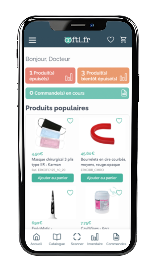
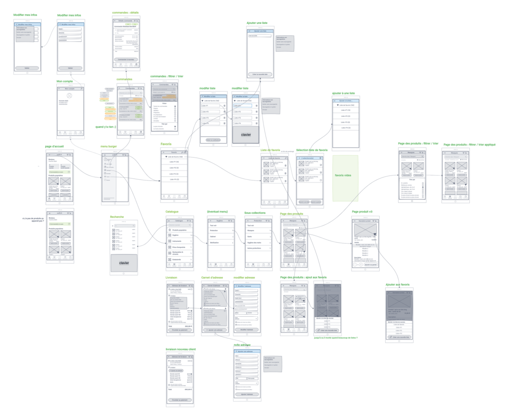
Objective: Visualize the structure and user flow of the e-commerce app that supports favorite lists while planning for future scanning capabilities, stock tracking, and monthly ordering.
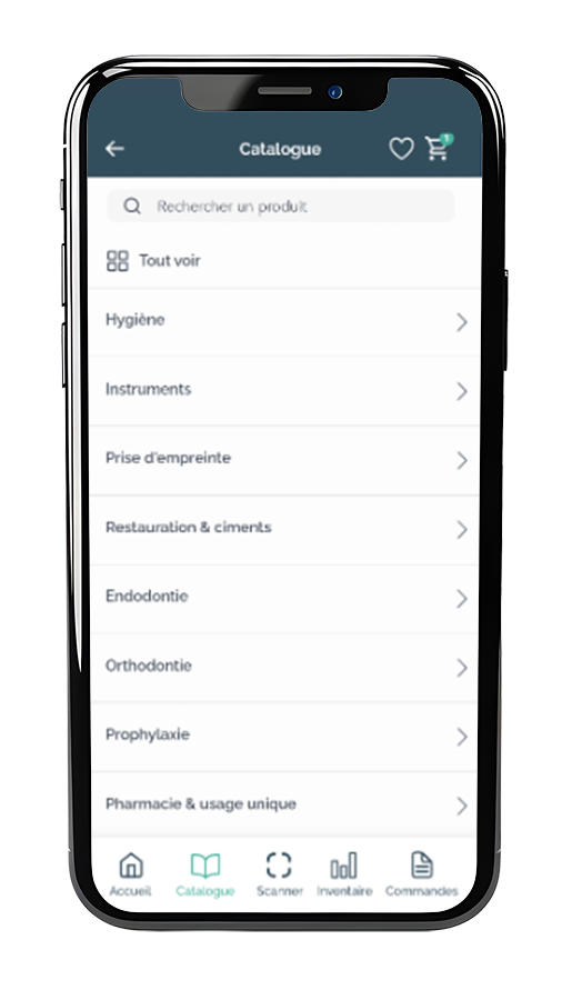
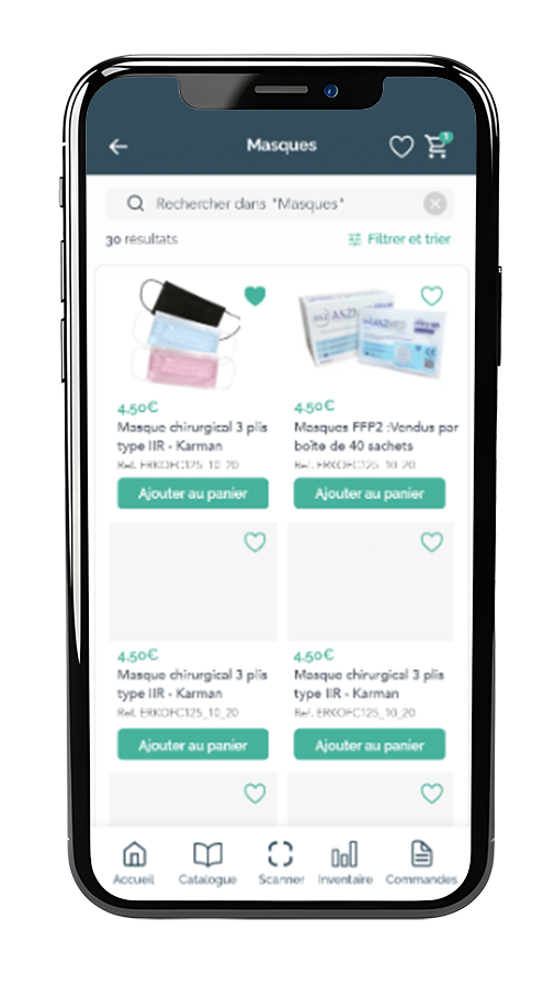
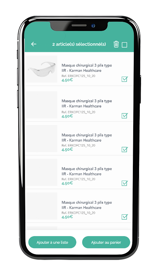
Product Listing Page: Design wireframes for a user-friendly product catalog where users can easily browse products. This page should include:
- Clear product images and descriptions.
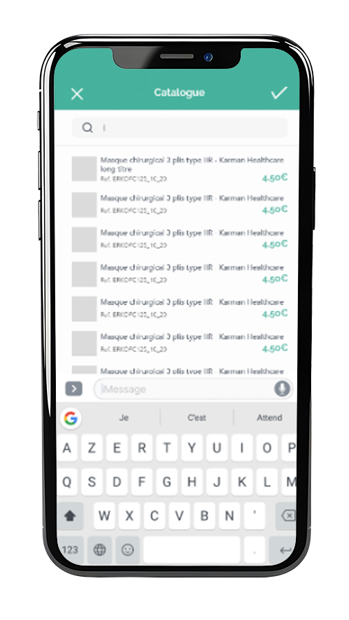
- Filters and search functionalities for easy navigation.
- Options to add items to favorites or reorder.
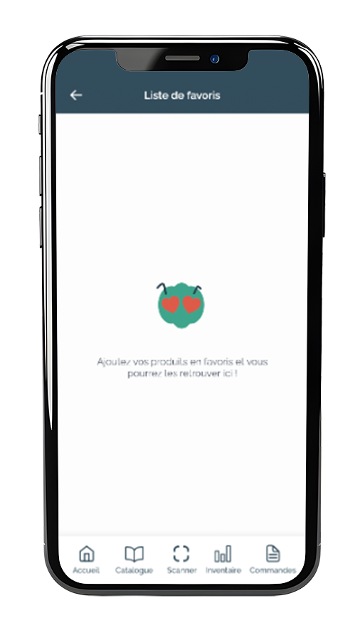
Favorites List Screen:
Create a dedicated screen for users to view and manage their favorite products into lists.
4. High fidelity design
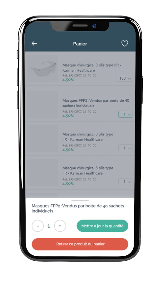
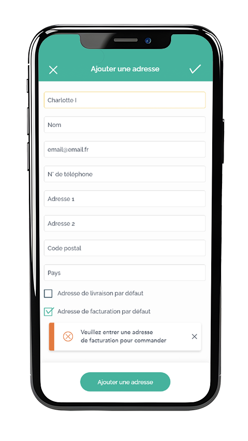
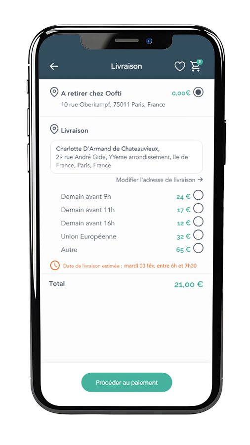
UI Design for E-Commerce Screens: Create high-fidelity designs for the core e-commerce features, ensuring a clean and engaging user experience, while planning for future scanning capabilities, stock tracking, and monthly ordering.