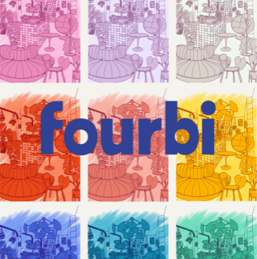
Fourbi: Logo & Visual Identity Client Fourbi Project Logo, brand guidelines Context A new concept store needed a logo a visual identity to launch its crowdfunding, social medias and physical store. Deliverables UX research & moodboards Brand guidelines E-mailing signature Social media templates Social media crowdfunding video Key skills Graphic design Social media Visual […]
Logo & brand identity refresh for Accel-Tech
Client
Accel-Tech
Digal Consulting
Project
Logo, brand guidelines, branded assets and templates
Context
Accel-Tech is an IT solution company who has successfully expanded into multiple African countries and continues to grow. With its increasing regional presence, the company now requires a cohesive and unified brand identity to maintain consistency, credibility, and recognition across different markets.
Deliverables
Key skills
-
Graphic design
-
Branding
-
Creating documentation
Impacts
- Enhanced Brand Consistency: Unified visual and messaging across regions and platforms to increase trust & reliability.
- Modernized Identity: Reflects cutting-edge technology and innovation.
- Broader Appeal: Resonates with both global and local markets.
- Scalability & Adaptability: Easily evolves with company growth and service diversification.
- Ease of Use for Employees: Accessible brand guidelines, templates, and training for non-designers.
Branding Refresh
Milestones:
- Kickoff
- Draft concepts for approval
- Revisions
- Delivery
Progress
Rebranding Objectives:
- Brand Consistency: Aligning visual and messaging elements across all platforms and regions to ensure a recognizable and professional corporate identity.
- Modernized Identity: Enhancing the company’s branding to reflect its cutting-edge expertise in AI, data science, and next-gen IT solutions.
- Global & Local Appeal: Creating a brand that resonates with both multinational clients and local businesses across Africa.
- Trust & Authority: Strengthening brand positioning as a reliable, innovative, and security-focused technology partner.
- Scalability & Adaptability: Ensuring the branding can evolve with the company’s future expansion and service diversification.
To ensure that the new brand identity is practical and accessible for IT professionals and non-designers within the company, the rebranding must prioritize:
- Standardized Brand Guidelines – A clear, easy-to-follow brand book with predefined templates for presentations, documents, emails, and social media using tools employees already know.
- Modular and Scalable Design – Simple, adaptable visual elements (e.g., color schemes, typography, logo variations) that are easy to apply.
- Training & Quick Guides – create a simple documentation to help employees apply branding effortlessly.
The old logo had the following problems :
- no longer reflects the client’s modern, cutting-edge identity in AI, data intelligence, and next-gen IT.
- Lack of Scalability – The logo didn’t adapt well across different formats
- Not Vector-Based – Without a vectorial format, resizing caused pixelation, making it unsuitable for high-quality applications.
Concept: logos proposals
Concept 1 : Acceleration
- The logo is created using the letters A and T
- It forms an upward arrow, symbolizing clear direction and continuous growth. Its triangular shape resembles a mountain, a universal symbol of ambition, challenges, and success.
- The clean, dynamic design ensures a bold and forward-thinking brand identity.
Concept 3 : Fusion
The “T” in Accel Tech is embedded within the “A” of the logo, appearing as pixels or small cubes that form the structure. This design illustrates movement, acceleration, and a company in constant evolution. It symbolizes connectivity, technological advancements, data, and an interconnected network.
Delivery
Logo choice
Concept 1 was ultimately chosen for its simplicity, following a vote from the employees. This decision reflects the company’s commitment to a modern, clean, and easily recognizable brand identity that aligns with its technological expertise and growth vision.
I suggested the color blue, which was highly appreciated for giving the brand a more mature, professional, and calm identity. Blue conveys trust, reliability, and technological expertise, aligning perfectly with the brand’s vision and industry presence.
Brand guidelines
I then created the Brand Guidelines and delivered the following:
- Web logo
- Print logo
- Vectorial logo
- Visual identity, fonts
- Color palette
- Do & Don't new branding tutorial
- Business cards
- Letterheads, Invoices
- Word document template
- Social media post template
- Presentation layout template
- E-mailing signature
Continue reading
Diarseconsulting: logo and website refresh
DiarseConsulting : Logo & Visual Identity, Website Client DiaRSE Consulting Digal Consulting Project Logo, brand guidelines, website Context After several years of activity, Dialor decided to rework his entire marketing strategy with the company Digal Consulting, who then contacted me to redesign the logo and website of Diarse Consulting who specializes in CSR (Corporate Social […]
FBF-services: logo creation and website refresh
FBF-Services: Logo & Visual Identity, Website Client Fbf-Services Project Logo, brand guidelines, website Contexte After several months in business, Magali did not have a logo or visual identity that would have facilitated the creation and sharing of resources by being easily recognizable. The objective is to create a recognizable visual identity for Magali, including a […]