Accel-Tech is an IT solution company who has successfully expanded into multiple African countries and continues to grow. With its increasing regional presence, the company now requires a cohesive and unified brand identity to maintain consistency, credibility, and recognition across different markets.
Fourbi: Logo & Visual Identity
Client
Fourbi
Project
Logo, brand guidelines
Context
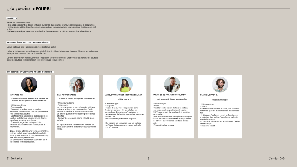
A new concept store needed a logo a visual identity to launch its crowdfunding, social medias and physical store.
Deliverables
Key skills
-
Graphic design
-
Social media
Visual identity
Milestones :
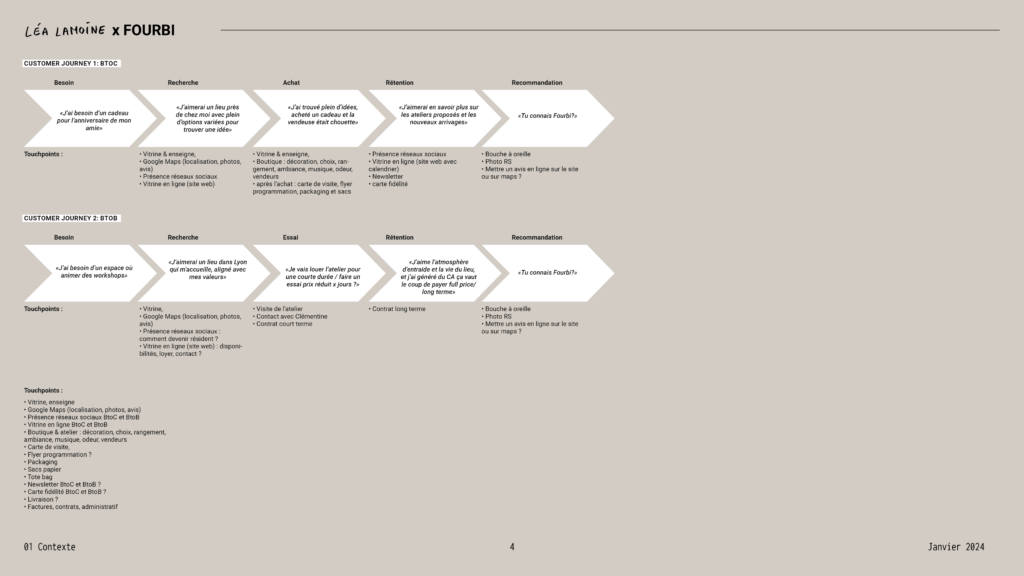
- Kickoff and initial brainstorming
- Draft concepts for approval
- Revisions
- Delivery
Context
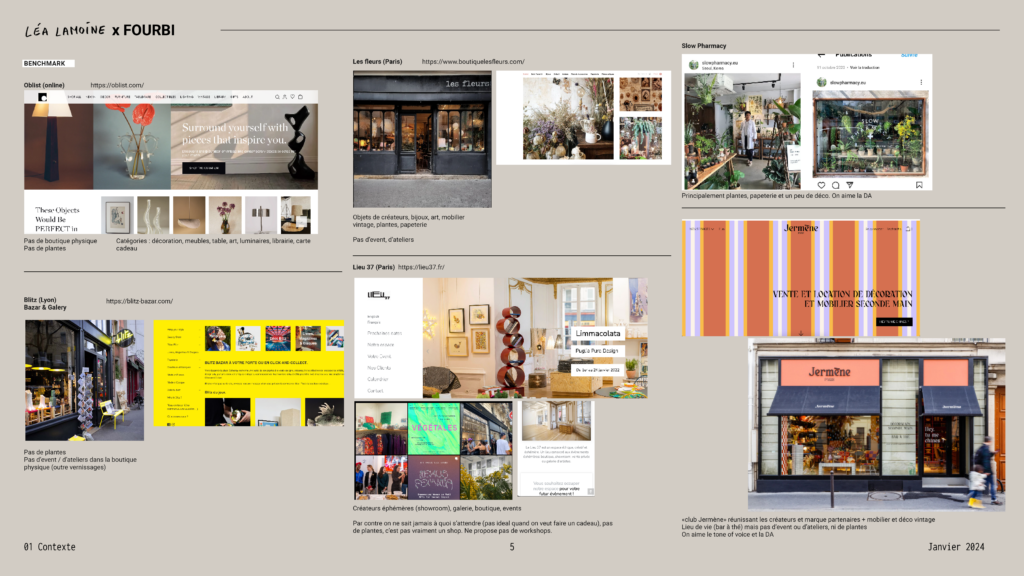
Create a logo for a new concept store in Lyon, which focuses on vintage decoration, contemporary artisanal objects, 19th- and 20th-century vintage pieces, plants, and artistic residencies.
- Target Audience: Individuals with an interest in unique, handcrafted items and vintage decor. This might include collectors, art lovers, interior designers, and people who value sustainability (given the emphasis on vintage items and plants).
- Style: A fusion of vintage and contemporary styles with a strong artisan influence. The store likely offers an eclectic mix of design aesthetics, combining the charm of old-world craftsmanship with modern artisanal creations.
Moodboards
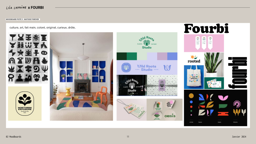
I created three moodboards guiding 3 different feels and aesthetics for the store:
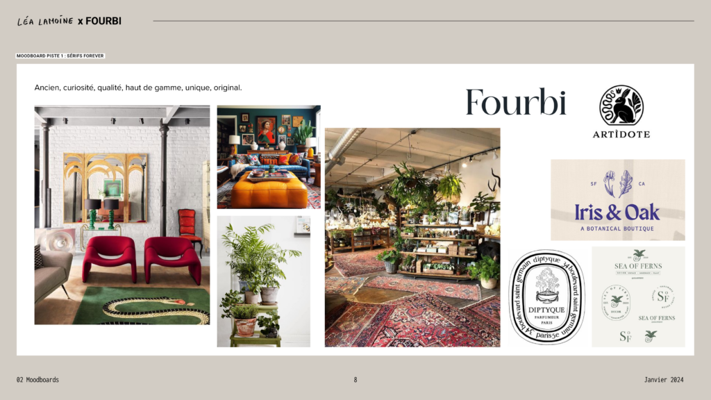
– Moodboard 1: an elegant, refined atmosphere, reminiscent of antiques or rare finds. The visual language could involve intricate details, classic typefaces (like serif fonts), and muted, sophisticated color palettes.
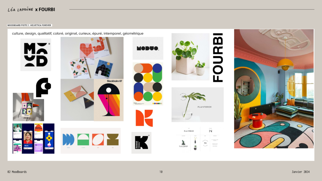
– Moodboard 2: This moodboard suggests a balanced mix of culture, clean design, and bold colors. Think strong, angular lines and abstract symbols to suggest a sense of structure and timelessness.
– Moodboard 3: This moodboard is more playful and artistic, with a focus on handmade, quirky, and colorful elements. Expect vibrant patterns, art-inspired visuals, something more imperfect and handmade than the other two leads.
In the end the client she couldn’t decide and liked all three moodboards! It made sense to provide a variety of options of logos that incorporate the different elements from the moodboards. Each design can capture a unique aspect of the store’s identity, allowing her to choose one that resonates most.
Logos research
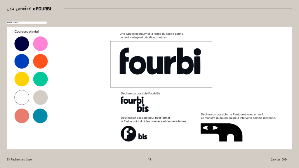
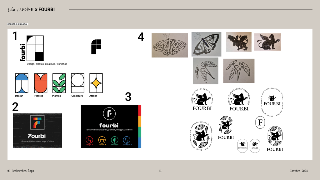
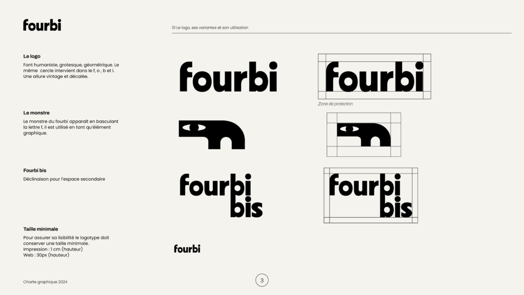
I designed 4 preliminary logos. Ultimately, she was drawn to logos 1 and 3, and we decided on a design featuring an abstract, timeless font paired with playful colors.
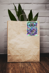
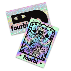
In the latest iteration, the “F” is transformed into a playful little monster. This character introduces a fun, interactive element to the brand, making it feel both unique and approachable.
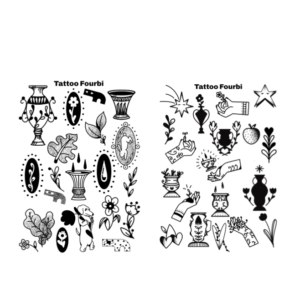
The minimalist logo opens up opportunities for collaborations with illustrators, allowing for dynamic interventions in the brand’s visual identity.
Deliverables
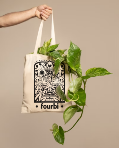
I then created the brand guidelines and delivered the following elements:
- Web logo
- Print logo
- Vectorial logo
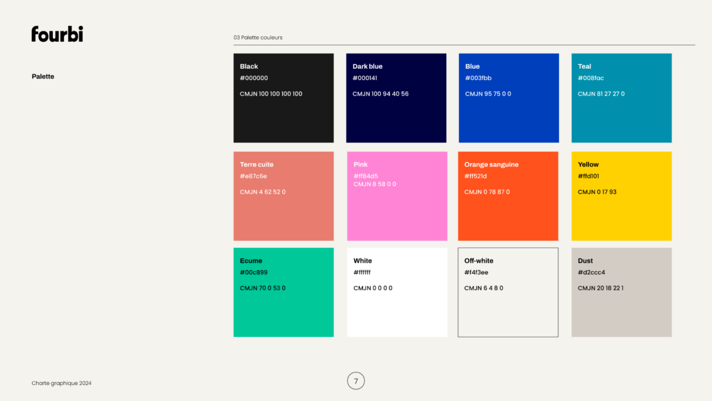
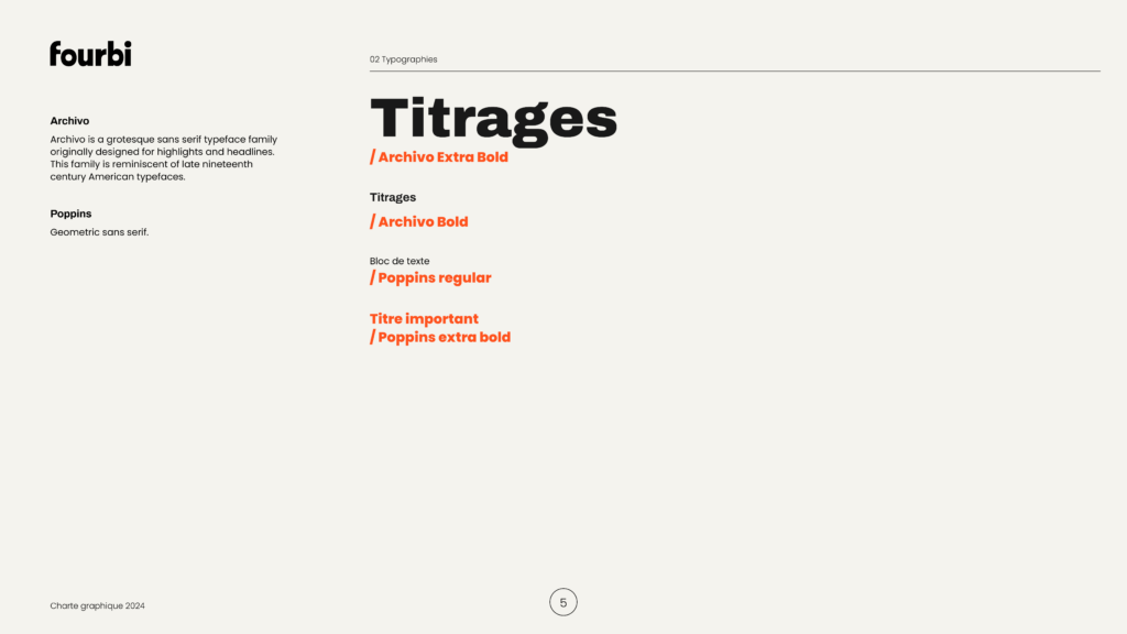
- Visual identity, fonts
- Color palette
- E-mailing signature
- Social media templates
- Social media crowdfunding video
Continue reading
Diarseconsulting: logo and website refresh
DiarseConsulting : Logo & Visual Identity, Website Client DiaRSE Consulting Digal Consulting Project Logo, brand guidelines, website Context After several years of activity, Dialor decided to rework his entire marketing strategy with the company Digal Consulting, who then contacted me to redesign the logo and website of Diarse Consulting who specializes in CSR (Corporate Social […]
FBF-services: logo creation and website refresh
FBF-Services: Logo & Visual Identity, Website Client Fbf-Services Project Logo, brand guidelines, website Contexte After several months in business, Magali did not have a logo or visual identity that would have facilitated the creation and sharing of resources by being easily recognizable. The objective is to create a recognizable visual identity for Magali, including a […]

