Accel-Tech is an IT solution company who has successfully expanded into multiple African countries and continues to grow. With its increasing regional presence, the company now requires a cohesive and unified brand identity to maintain consistency, credibility, and recognition across different markets.
FBF-Services: Logo & Visual Identity, Website
Client
Fbf-Services
Project
Logo, brand guidelines, website
Contexte
After several months in business, Magali did not have a logo or visual identity that would have facilitated the creation and sharing of resources by being easily recognizable.
The objective is to create a recognizable visual identity for Magali, including a logo and cohesive branding, and to redesign the website with consistent aesthetics, improved UX, accessibility, and SEO.
Deliverables
Key skills
-
Graphic design
-
UX, SEO & accessibility Audit
-
Wireframes & design Figma
-
HTML, CSS, Javascript Integration
Before
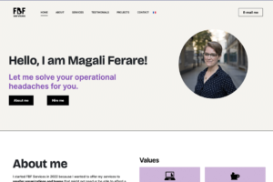
After
Impacts
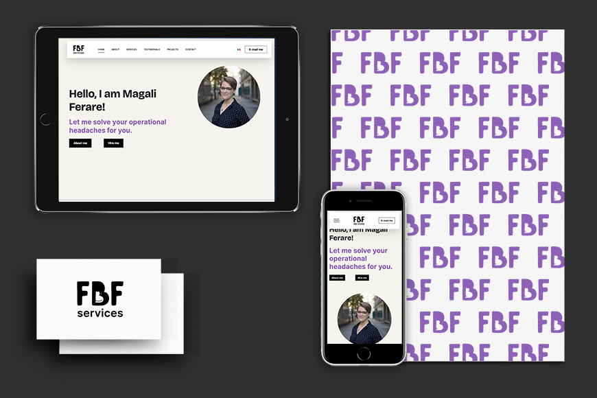
- Enhanced Brand Recognition: A distinctive logo and consistent branding improved visibility and identity.
- SEO Improvements: Better content organization led to improved search engine rankings
- Streamlined Information: The one-page layout with well-structured content allows users to quickly find information, saving time.
- Clear Communication of Services: The restructured content helps communicate the services offered more effectively, enhancing client trust.
- Clear Call-to-Actions (CTAs): Improved navigation and user journey enhance the likelihood of conversions, whether through contact forms or service inquiries.
Phase 1: Visual identity
Milestones:
- Kickoff and initial brainstorming
- Draft concepts for approval
- Revisions
- Delivery
Progress
The initial brief was fairly broad.
Magali is a competent professional who is warm and has a great sense of humour. For example, her company is named after her cat.
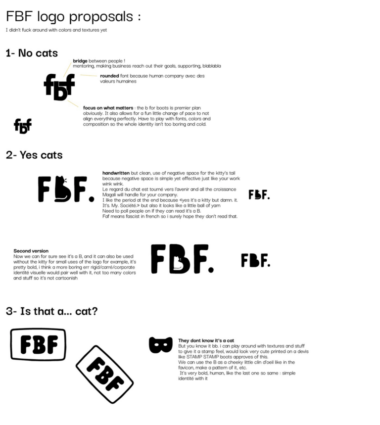
I wanted to offer her several options, which would allow her to decide whether she wanted her logo to have a lot of personality or to be more sober.
Concepts
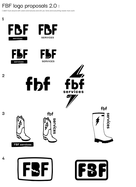
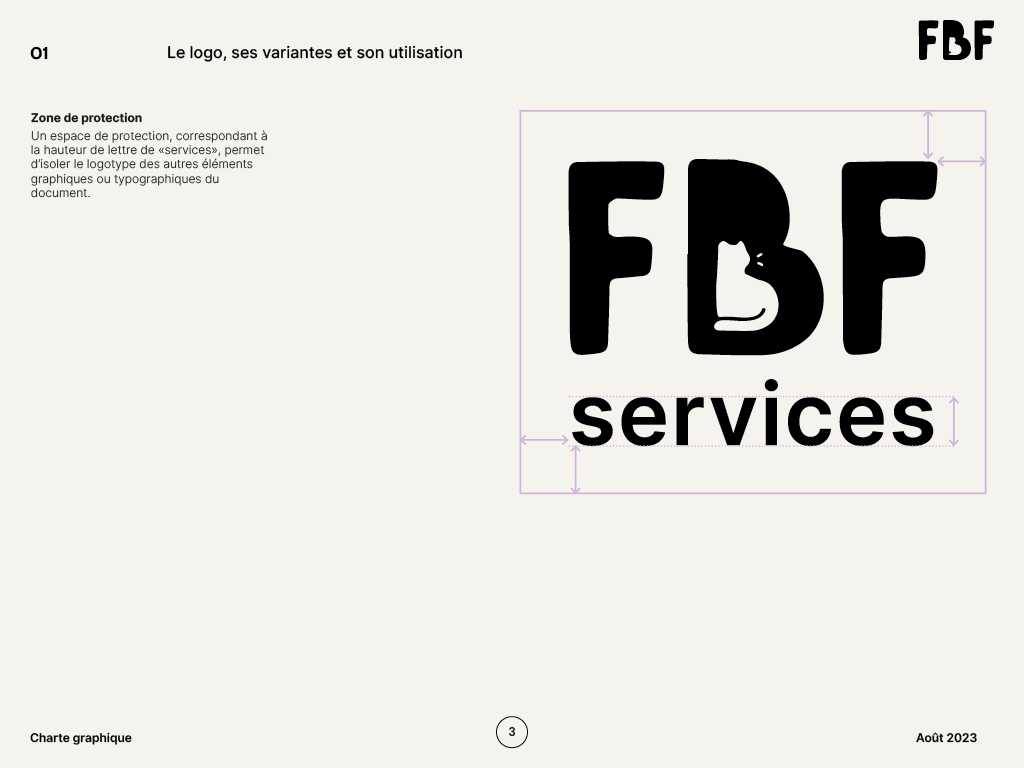
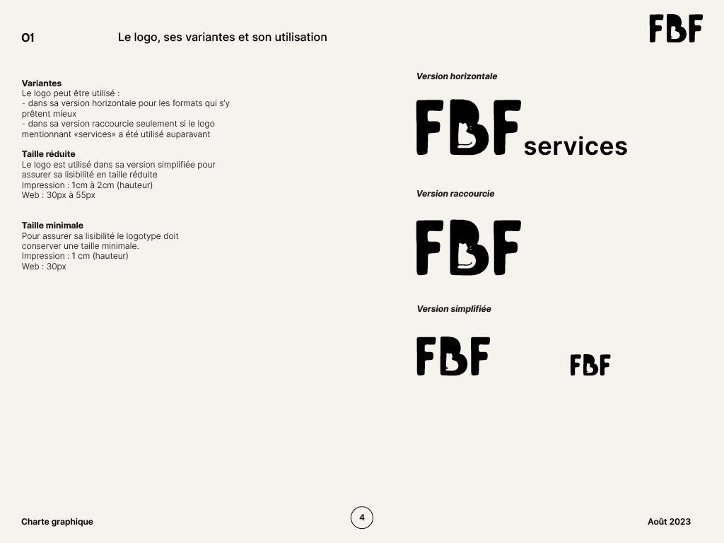
We decided together to move forward with option 1 of the 2.0 proposal (especially the first two versions, with the cat inside the B) for legibility and an easily recognizable logo. We discussed making the rest of the branding a bit more ‘traditional’ to balance the playfulness of the logo.
Deliverables
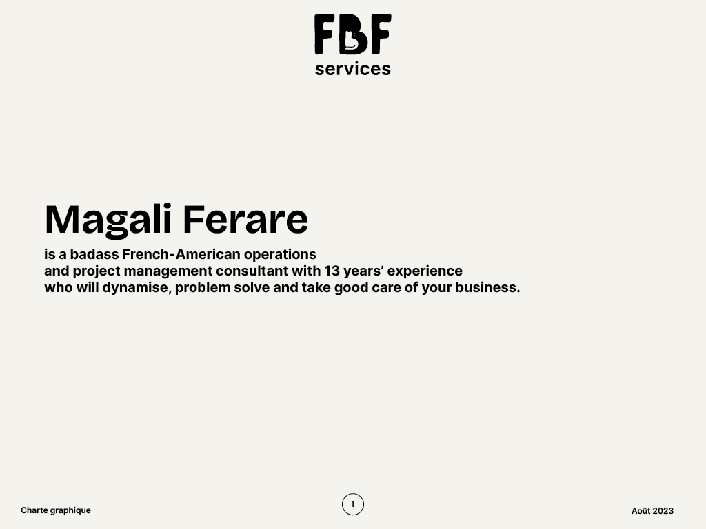
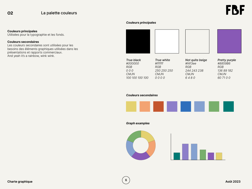
I then created the brand guidelines and delivered the following elements:
- Web logo
- Print logo
- Vectorial logo
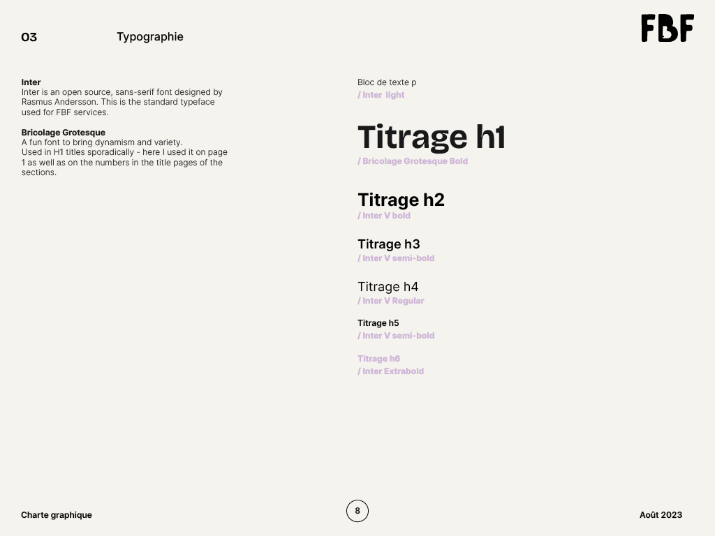
- Visual identity, fonts
- Color palette
- Slides layouts
- E-mailing signature
Phase 2: Website refresh
Milestones:
- Kickoff + initial brainstorming
- Audit
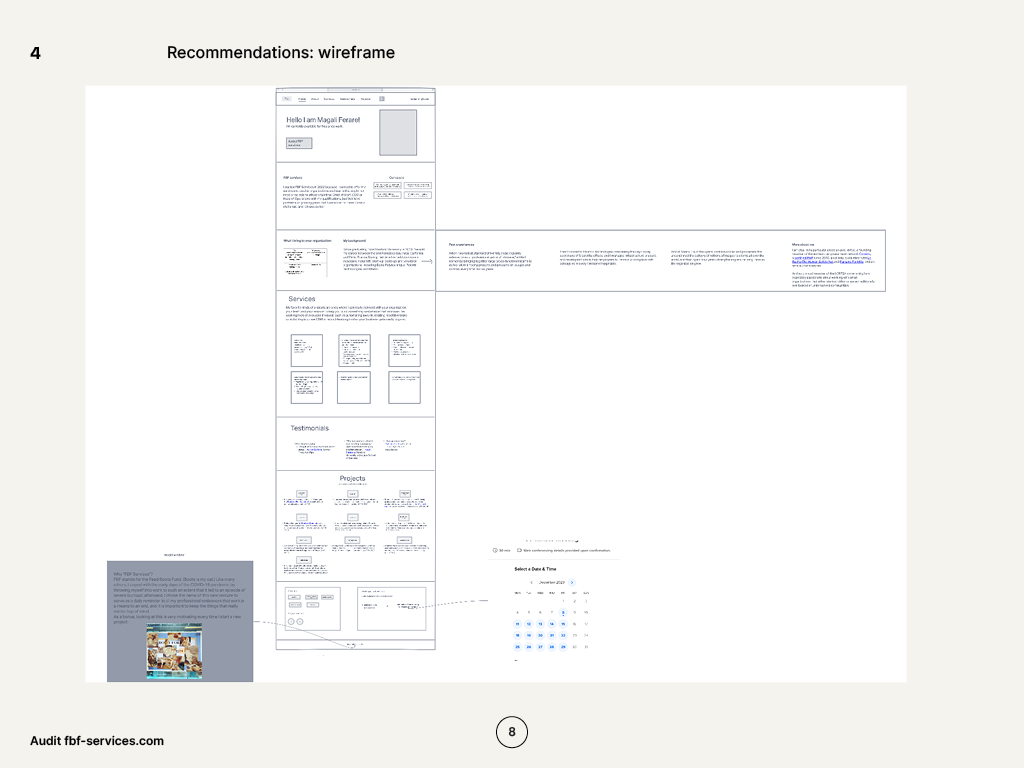
- Wireframes
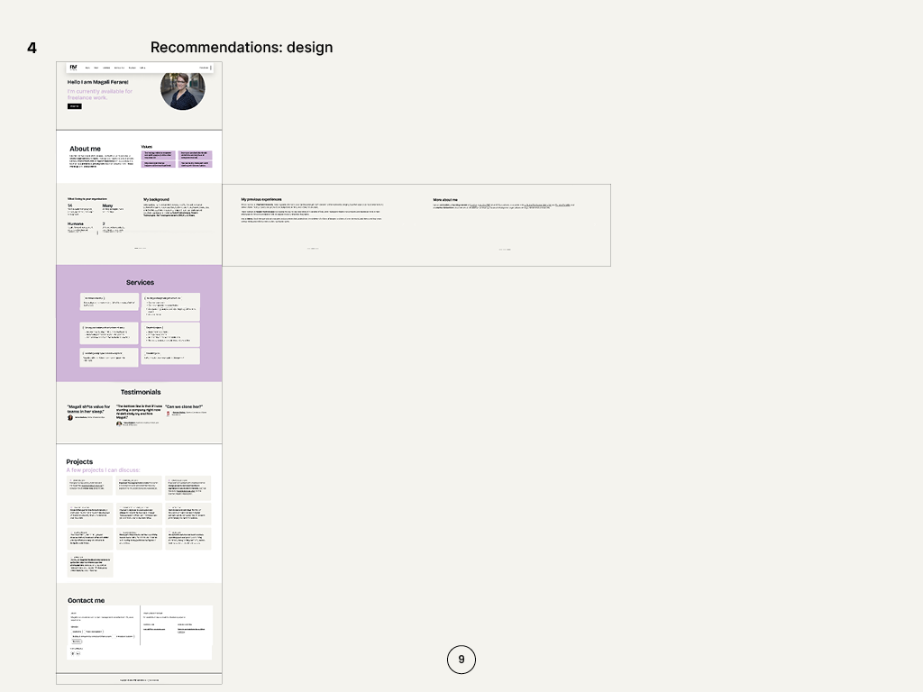
- Design & integration
- Delivery
Progress
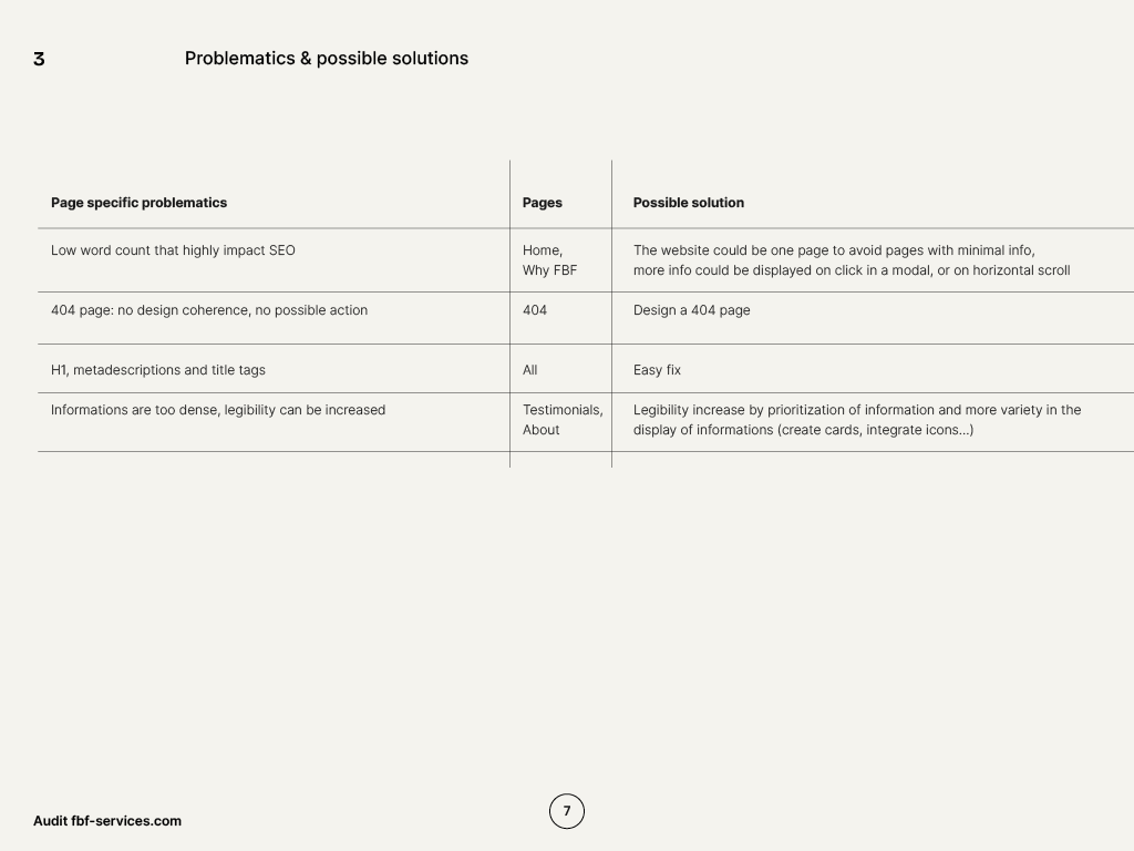
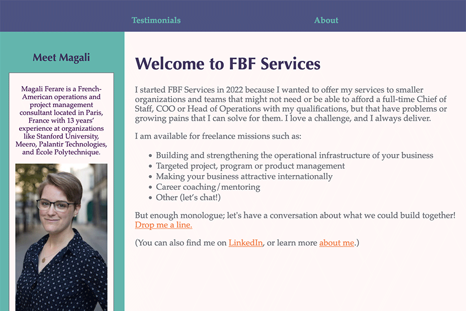
The website lacked a consistent aesthetic and was designed without consideration of UX, accessibility or SEO principles.
Her requirements were that it be:
- Clean,
- Quick to load
- Consistent visually
- Fully accessible and functional on all devices
- In English and French
Audit
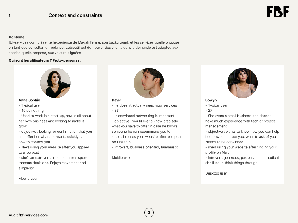
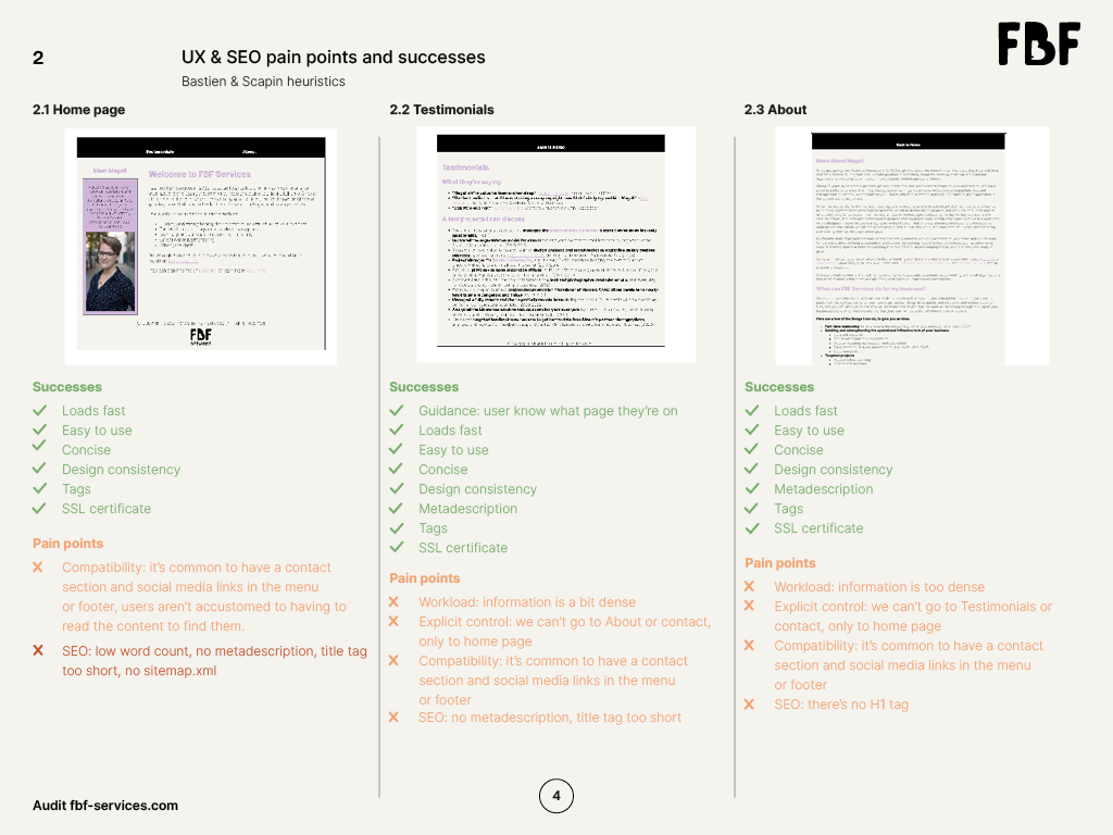
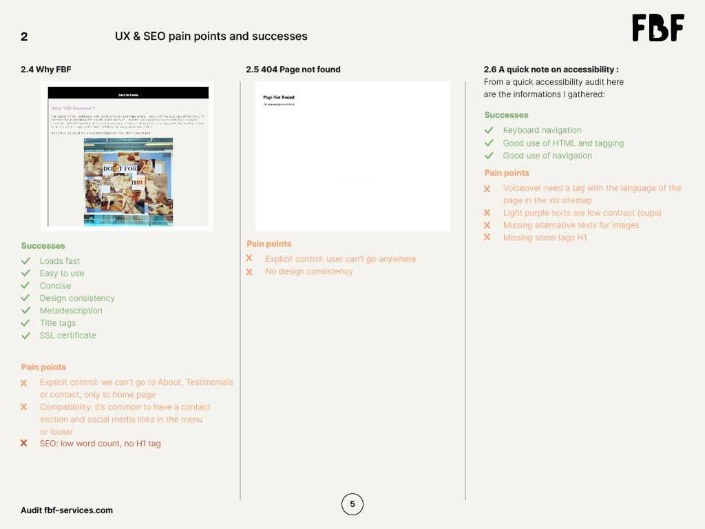
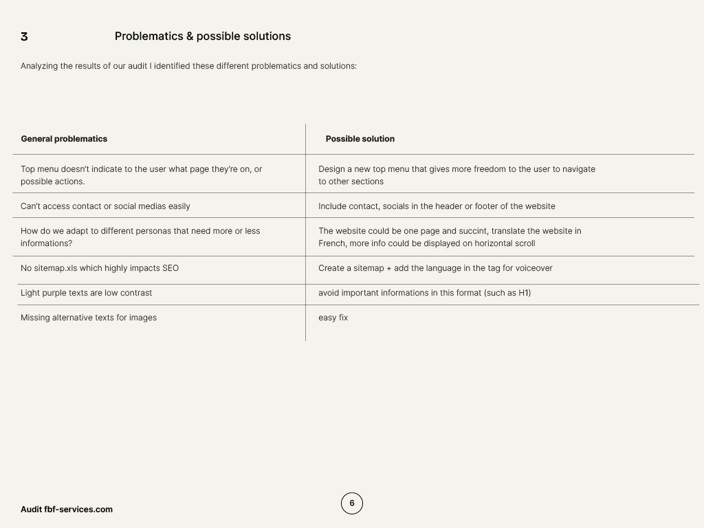
My initial audit (Bastien & Scapin criteria, and quick accessibility & SEO audit) highlighted the following problems on the site that needed to be addressed:
- Navigation
Pain point
One of the biggest problems was the header menu which was not the same on all pages, and the contact information could not be found on each page.
Solution
Creating a header and footer that are clear and direct the user to contact FBF-services was one of the priorities.
- Content
Pain point
Many existing pages did not have enough content, which was a problem for the user journey and for SEO. Some other pages had a very high information density.
Solution
We decided to go with a one-page site and reorganize all of the content and hierarchize information.
- User journey
Pain point
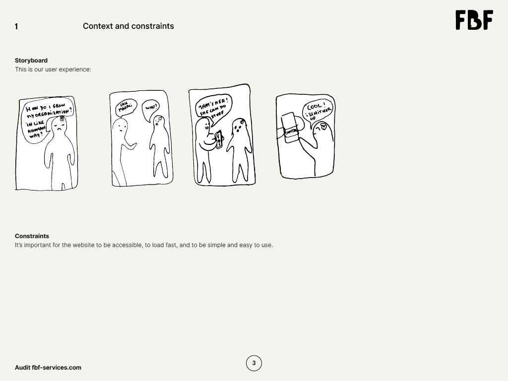
On a one-page site, some users will want to quickly browse the site to see if FBF-services meets their needs, others will want to take the time to learn about Magali’s professional background.
Solution
We decided to add a horizontal scroll section which allows you to browse the site in the blink of an eye or take the time to browse each section.
Wireframes
Design, integration & delivery
I then designed the website on Figma then integrated the final site and its 404 page.

Continue reading
Fourbi Logo and visual identity
Fourbi: Logo & Visual Identity Client Fourbi Project Logo, brand guidelines Context A new concept store needed a logo a visual identity to launch its crowdfunding, social medias and physical store. Deliverables UX research & moodboards Brand guidelines E-mailing signature Social media templates Social media crowdfunding video Key skills Graphic design Social media Visual […]
Diarseconsulting: logo and website refresh
DiarseConsulting : Logo & Visual Identity, Website Client DiaRSE Consulting Digal Consulting Project Logo, brand guidelines, website Context After several years of activity, Dialor decided to rework his entire marketing strategy with the company Digal Consulting, who then contacted me to redesign the logo and website of Diarse Consulting who specializes in CSR (Corporate Social […]

